2ND ADDRESS
Connecting Hosts & Guests for Extended Stays into Furnished Homes
2ND ADDRESS
Connecting Hosts & Guests for Extended Stays into Furnished Homes
ZENTLY
Transforming Rental Living & Property Management
2ND ADDRESS
Connecting Hosts & Guests for Extended Stays into Furnished Homes
Make voice - video calls and send SMS through any devices
Make voice - video calls and send SMS through any devices
Make voice - video calls and send SMS through any devices


CAMP CUPCAKES
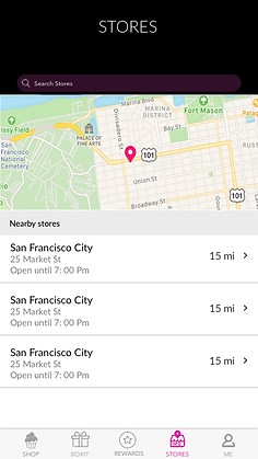
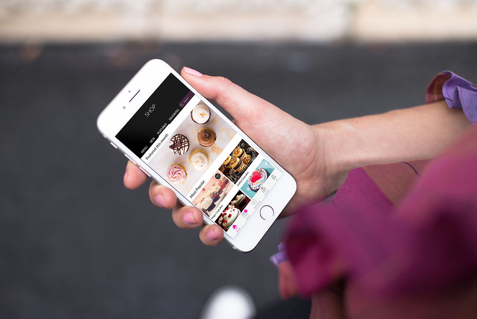
A mobile app for Order Pickups and Rewards Program

Project Overview
This project was done as a design sprint for a challenge. The idea was to introduce a mobile app for a San Francisco based cupcake store - Camp Cupcakes to design the pickup order experience and offer rewards programs. After doing the initial user research, competitive audit defining the target users, and developing strategy, I worked on high level architecture and navigation, wireframes, prototypes and conducted usability testing. After my initial discovery & defining the key functionalities within the feature, I started to design & refine the user flows, interactions, UI and visual design for the checkout process which highlights the reward program.
My Role I UX/UI Designer Skills I User Flows, Wireframes, Prototypes Tools I Sketch/Invision

DISCOVERY & DEFINE
At a first step, it was critical to gather internal and external data that would help me understand pickup order shopping experience and loyalty program within same context to help me position it well. It was also good to understand the needs, motivations, and pain points of customers who will be mostly using this app and contextualize the scenarios in which they will do that. I also tried to get understanding the competitive landscape
UX Research: Building personas, Scenarios,Use cases


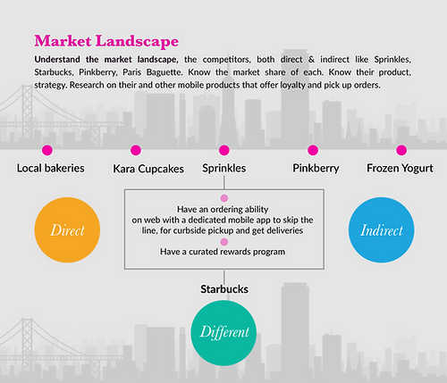
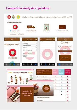
Competitive Analysis
I started with market research trying to find the direct & indirect competitors. I also looked for apps that had a loyal customer base with great reward program for inspiration. Since Sprinkles a direct competitor had a mobile app, I looked into that and found that the experience was pretty broken.
The main idea of of the app was wanted to give a cohesive brand experience to the users, increase their engagement with the app and the brand, we wanted to give a along with giving winning their loyalty by share their purchases with the social media.

DESIGN
After the initial reseeach work and synthesis of our research into personas, user journeys, user stories, I started working on the high level architecture of app. Deciding the structure, gave me a direction into figuring the main navigation and the flow patterns within the app and finally working on designing the feature which was an iterative process of evolving ideas, converging on idea and wireframing it. I finally created visual mocks and a prototype.
Information Architecture & Navigation
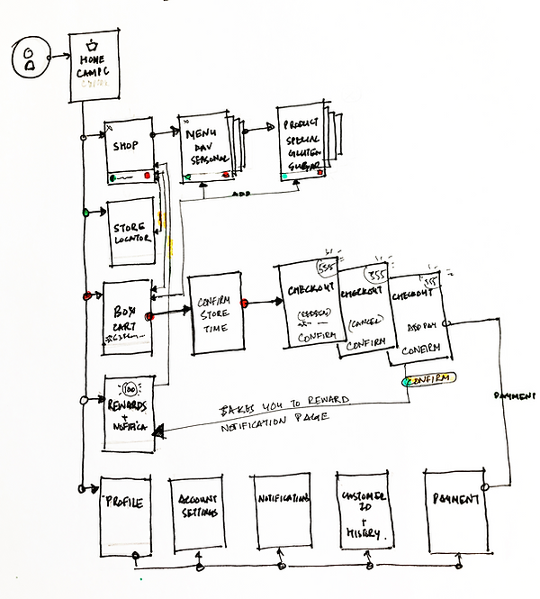
Once I decided on the main features and user flows, I created a high-level architecture and navigation of the app to fit all the features, functionality and content.
UX Flows & Initial Wireframes
Once I decided the user flow, I started working on the UI patterns for each wireframe and seeing that I fit all the functionality and content.


REFINEMENT
Iterative Rapid Prototyping
Once I decided the user flow, I started working on the UI patterns for each wireframe and seeing that I fit all the functionality and content.
VALIDATION & REFINEMENT
Usability Testing
Once my prototype was ready I started testing the app with some participants developed from my personas. Also for getting rich insights, I tested it with them on the go so as to be true to the scenarios.

Some of the key insights from this study helped us

FINAL SOLUTION
Visual Mocks & Style guide
Once I decided the user flow, I started working on the UI patterns for each wireframe and seeing that I fit all the functionality and content.