
2ND ADDRESS
Connecting Hosts & Guests for Extended Stays into Furnished Homes
2ND ADDRESS
Connecting Hosts & Guests for Extended Stays into Furnished Homes
ZENTLY
Transforming Rental Living & Property Management
2ND ADDRESS
Connecting Hosts & Guests for Extended Stays into Furnished Homes
Make voice - video calls and send SMS through any devices
Make voice - video calls and send SMS through any devices
Make voice - video calls and send SMS through any devices


2nd Address Host Beyond
Host Onboarding & Listing Creation Experience at 2nd Address


Project Overview
2ND ADDRESS // is an two-sided marketplace of furnished premium homes for extended stays that connects hosts with guests, traveling for business or long vacations. For a marketplace like 2nd Address, a large supply of high quality properties that meet the demand of the guests is crucial.
PROBLEM // Designed in 2015, 2nd Address' host onboarding, listing creation, listing dashboard and listing edit experiences had become tedious and nearly impossible for hosts to complete on their own. In order to quickly seed and grow new markets outside of San Francisco, as well as respond to our Guest users, we needed to have a self-serving platform for Hosts to onboard, list, market and manage their properties at 2nd Address.
DESIGN CHALLENGE // With the given problem our opportunity was to redesign the Host Onboarding, Listing Creation, Dashboard & Edit experience that would be a breeze to use and become a preferred place to host.
GOAL & SUCCESS METRICS// To create a onboarding & listing creation experience that reduces the task time and makes it easier for host to create listing while on business side it helps to increase the supply on listings on the platform.
My ROLE // As a lead UX designer, I am responsible for driving the overall design and execution of this experience and doing all the hands-on work. I collaborated with the product manager, engineers, Host Supply Manager, Care Team, Content Strategist, Marketing Manager. The project is in V1 development as we design and refine more.
MY ROLE
Product Lead Designer
SPECIALITIES
UX Design
Interaction Design
Information Architecture
UI Design
Visual Design
SKILLS
White boarding, User Flows
Wifreframing
Interactive Prototype
Specs & Asset Creation
Development Support
KEY USER EXPERIENCES DESIGNED
HOST
SIGNUP
HOST
ONBOARDING
HOST
LISTING CREATION
LISTING
DASHBOARD
LISTING EDIT
UPDATE
DISCOVERY
Design by Accretion
I kicked off the design project by auditing our current experience, trying to look into every information we gather from hosts and all the missing pieces. I and my product manager gathered all the data about what kind of hosts are listing on 2nd Address. We collected all the feedback and user stories from our current care team and supply team not only about our hosts but what what our guests were missing to see in the listings preventing them to book.


Insights
-
Experience was outdated with old fashioned components & styling
-
No Display of Navigation flow, making it difficult for Hosts to onboard.
-
No Value Propositions to motivate hosts to onboard at 2nd Address.
-
No Informative tips to educate Hosts to optimize their listing.
-
Fundamental usability issues, with disparate features competing for focus.
-
No inputs for syncing iCal or manually setting availability calendar
-
Was not responsive. Experience was broken on a mobile device.
-
Reliability and performance issues increased exponentially
-
Business Stay Approved, Extended Weekly Stay were added Programs later and were not coherent with the experience
DISCOVERY
Empathizing with Users
We started with doing more user research by interviewing some of our hosts to better understand their motivations, pain points and needs while creating a listing and editing a listing. We also interviewed few of our guests and start to understand what they were missing to see in the listing which was preventing them to book. Along with that we also interviewed 2nd address care/ops team so that we could gather all user stories they had which could give us additional insights for creating right foundational framework.


Host Core Values, Pain Points, Needs, Motivations
Optimize Occupancy and Revenue
"I want to keep my listings full so that I can maximize revenue and not worry about finding tenants"
Secure Low-Risk Tenants
"I want high quality tenants that have been vetted and are traveling for business"
Easy, Transparent Processes
"I want an easy way to secure tenants, optimize my listings, and understand what happens next"
Comfortable Homes
“I’d love to find a reliable, comfortable home away from home that will allow me to focus on my job and unwind at night.”
Professional Service
I want all amenities and professional services so that I can be my productive best.
Hassle Free Booking
I want to book at the comfort of my couch. I don't want paperwork, walk-throughs or phone calls.


DISCOVERY
Competitive Analysis
We looked at other competitive host onboarding and listing creation experience to benchmark, learn and get inspiration from their IA, navigation flows, features, functionality, information architecture, and visual design while also understanding what was missing in their experience which we could add to enhance our product. After going through whole flow, me and my product manager both reached certain alignments as to how we want to structure the whole experience.


Airbnb Listing creation
3 Main steps with many sub-menus nested within. No Visibility of how long the listing creation flow is and what all pieces of information is needed. Inconsistent Progress Bar indicating progress over each step and not the entire listing process. No way to navigate to earlier steps. Great Information tooltips and illustrations.
Homeaway Listing Creation
6 Main steps with sub-menus nested within. Visibility of how long the listing creation flow is and what all pieces of information is needed. Progress Bar indicating progress through the listing process. Way to navigate to earlier steps. Almost Similar Flow for listing Creation & Edit/Update.
DEFINE THE VISION
UX Principles & Strategy
Keeping all the insights in mind, we created problem statement, our hypothesis, opportunity statement, guiding principles and high level architecture to start designing for all the features within the product. We figured it was best to get as much detailed information about listings and educate them on the way as how to create optimized listings and keep them updated. Yet we had to balance such a long process to remain engaging and delightful. We had a kickoff meeting with all the stakeholders, subject matter experts to align and develop a shared understanding of our goals and plan the design and development project ahead. .
OMNICHANNEL
GUIDING
EDUCATIVE
EFFICIENT
EASY/ENGAGING
EMPOWERING
INFORMATIVE
DELIGHTFUL
DEFINE REQUIREMENTS
User Story Map : As a User "I want too"
We created a list of all the features requirements from hosts and guests to assimilate all the information we require our hosts to input. All the user stories then translated into "How might we?"- a great starting point for defining features and start designing . We sorted all these questions into affinity diagram which would help us articulate our Information Architecture, Navigation flow and all possible functionality within each step.
I want to create/see good listing?
I want to add/see availability
I want to add/see detailed photos
I want to set/see fees and taxes?
I want to set/see booking types?
I want to set/see pricing?
DEFINE HIGH-LEVEL FLOWS
Navigation Flow & IA
Once we had all out user stories, requirements, we ran into a card sorting exercise and created a high level architecture and flow which would keep on getting refined as went through cycles of flow design, features design & design reviews. This high level architecture was used as a map for discussion for each section and contents within it.


IDEATE I PROTOTYPE I USABILITY TESTING
Navigation Flow & IA
Our initial challenge was how we would take the hosts through the Listing Creation Process and keep guiding them to complete the long complex process.
We came up with two options - 8 Step vs 3 Step process with sub-steps.
-
We came up with two concepts to test with the team and users to see which flow they preferred and gather insights.
-
We also developed some wizard ideas and progress bar notations to test the preference and understand the feasibility.
-
We in parallel started to add all the input fields and input controls and get feedback on any missing pieces or valuable insight they could provide.
-
Also in parallel we tried to work on nomenclature, navigational labels and figure if all our feature/functionalities were rightly sorted.
Finally our tests with users and stakeholders suggested we go with
8-Step Flow for its clarity, visibility and easy navigation to any step.


DETAILING DESIGN
Perfecting the Navigation UI
Once we had decided we would take the 8 step approach, we rigorously worked the wizard out wizard ready, we got into adding the touch of progress bar to make visibility of where the host in the listing creation process and came up with few iterations which I tested with our stakeholders and users.


IDEATE I CREATE EXPERIEMENT I PROTOTYPE I TEST
Each Step Inputs Fields & Controls
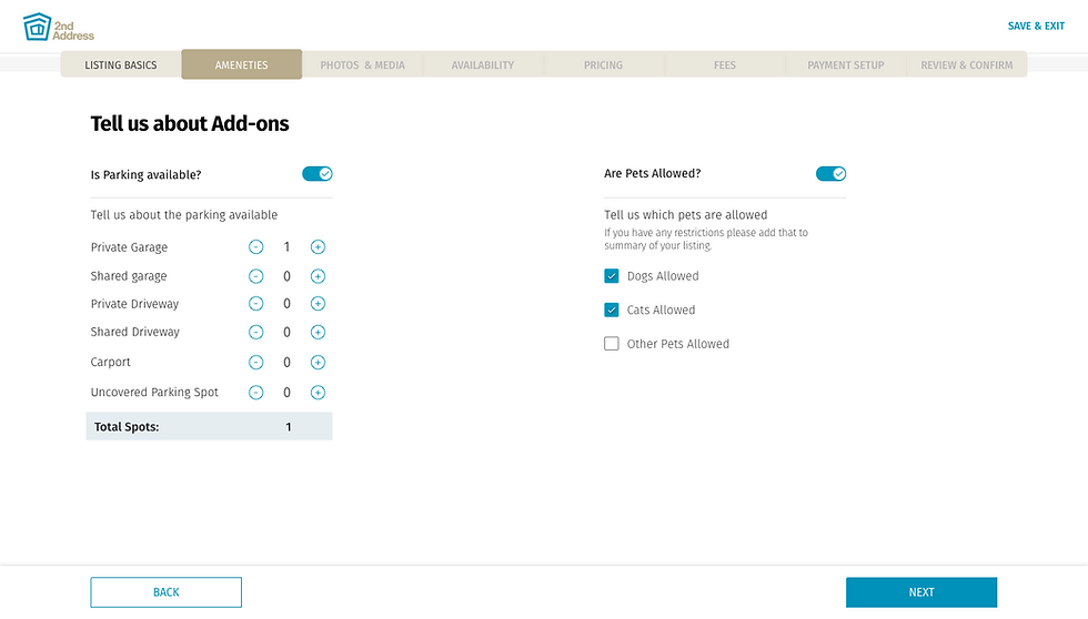
For each step input fields & controls, I went through cycles of requirements, consensus, approvals, detailed specs and handoffs. My process involved sketching and white‐boarding concepts and flows with my PM partner and then translating these directly into hi‐fidelity design comps. We had to detail out a lot of input controls for each step : amenities, photos, availability calendar, parking, pricing, fees, review.
After white boarding ideas, I would quickly create mocks and prototypes. Prototyping was the most effective way to gain meaningful feedback from the team, consensus from stakeholders and approval from senior leadership. I was able to easily distribute these as videos and recycle them for Usability Testing.


IDEATE I EXPERIEMENT I PROTOTYPE I TEST
Making it responsive
We in parallel were working to design the experience in a responsive way that it works across desktop, mobile and tablet. This required that at a certain breakpoint the wizard move to just a progress bar and we allow for navigation drawer to switch between sections. We also had few screens like availability and photos where our functionalities had to be optimized.


Key Features!
-
Signup easy!
-
Benefits of Hosting on 2nd Address
-
Detailed Listing
-
Location marker & Price Estimate
-
Bulk upload photos, reorder photos, assign type.
-
Set availability and block dates.
-
Import iCalendars to Sync.
-
Set manual blocks and Export
-
Set Booking Settings, Pricing, Fees
-
Set Payout methods
DESIGN > DETAILED PROTOTYPE
High-Fi Mobile Experience
VALIDATION, LEARNING & REFINING DESIGN
Usability Testing
Once the final designs were ready we did a last round of usability testing with our users and stakeholders to make any last minute refinements.
-
We also decided to build a lite weight version first an incrementally add all features that were designed. For that I created another set of mocks and prototype to delivered to the development team.
-
We added a input field for users to add an URL Link to any other platform there were listing at. This allowed us to scrape information and add the possible information automatically like photos.
-
We also removed the payout section as that involved hosts to put the bank information before they publish listing. We saw our hosts inhibited to add bank information at this stage and possibly saw that would lead to big drop-off in completion of task .
After the usability testing, we also worked with the content strategist to refine the copy so that we have consistent language and messaging throughout the experience and our platform.
FINAL DESIGN
High-Fi Mock Ups : Mobile Experience

DESIGN > DETAILED PROTOTYPE
High-Fi Desktop Experience


FINAL DESIGN
High-Fi Mockups: Desktop Experience


DELIVER & DEVELOPMENT SUPPORT
Style guides, Design system, Hand-off, QA
Once our designs were validated and refined, I delivered all the styleguides, pattern library, specification through invision, assets to our engineering team. I was doing daily checkups if any design guides were needed from my side. Once the built was ready. I did the whole front end QA as well we had bug bash to report any bugs.


POST - LAUNCH
Outcome & Optimization
Once the redesigned product was launched, we partnered with our analytics team to dive into metrics as how the host listing creation funnel was performing. We also performed usability testing on the live product and watched video recordings to get insights and feedback for improving the UX.
3x
INCREASE IN SIGN UP
AS HOSTS
1/2x
TIME TAKEN TO COMPLETE
CREATING LISTING
50%
COMPLETION RATE
OF LISTING CREATION
FINAL THOUGHTS
Learnings & Takeaways
-
Add the illustrations and informational tips for hosts that were left out of scope for this phase.
-
Keep enriching & enhancing the experience from the learnings & insights gathered.
-
Try to lead and influence with user-centered perspective and keep everyone in the team in same boat.
-
Keep the feedback loop on with users and all stakeholders through the process.